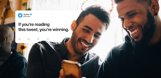
This update is available to everyone already and if you still don't have it for some reason you can try to reboot your device or clear the app cache. It brings a new font called Chirp along with some buttons being coloured dark. This visual update is just the beginning of a new design rollout that will affect more sections of the Twitter app.
Today we release updates for colors & typography! See @TwitterDesign post for full details. The A11Y updates are:
— Twitter Accessibility (@TwitterA11y) August 11, 2021
- Higher color contrast of buttons, links, focus
- Easier reading with left-aligned text & more space between text
- Fewer distracting gray things
What do you think? pic.twitter.com/Umu3F1iJjb
You can also notice a slightly new layout of Spaces top bar as well as some additional changes in the DMs section or voice messages animation 🔥
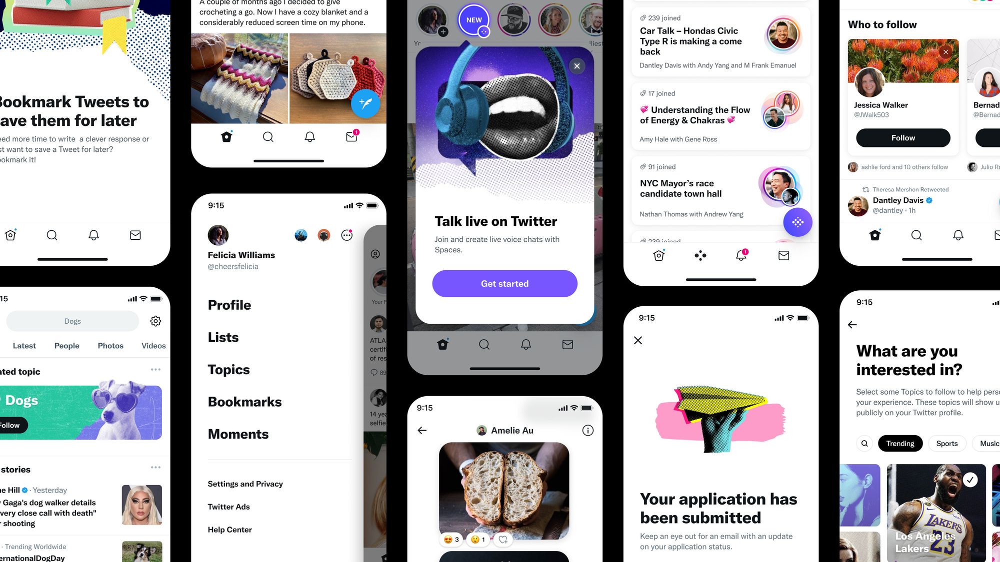
If you applied for ticketed Spaces feature, you can also see a new screen that is already a part of a new design concept (and it doesn't promise to review your application within the next 10 days anymore).
You can also review some of these tweets by @WFBrother if you want to compare how it was before and how it is now.
So, do you like it or hate it? WDYT?
Tester Context:
- 📲 Twitter is a popular social network build around short text messages.
- 📲 Twitter is also available in Beta and you can opt-in as a tester via Google Play.
- 📲 Twitter is also available in Alpha and you can opt-in by joining its Experiments Google Group
- 📲 Follow @TestingCatalog on Twitter for the most recent updates.