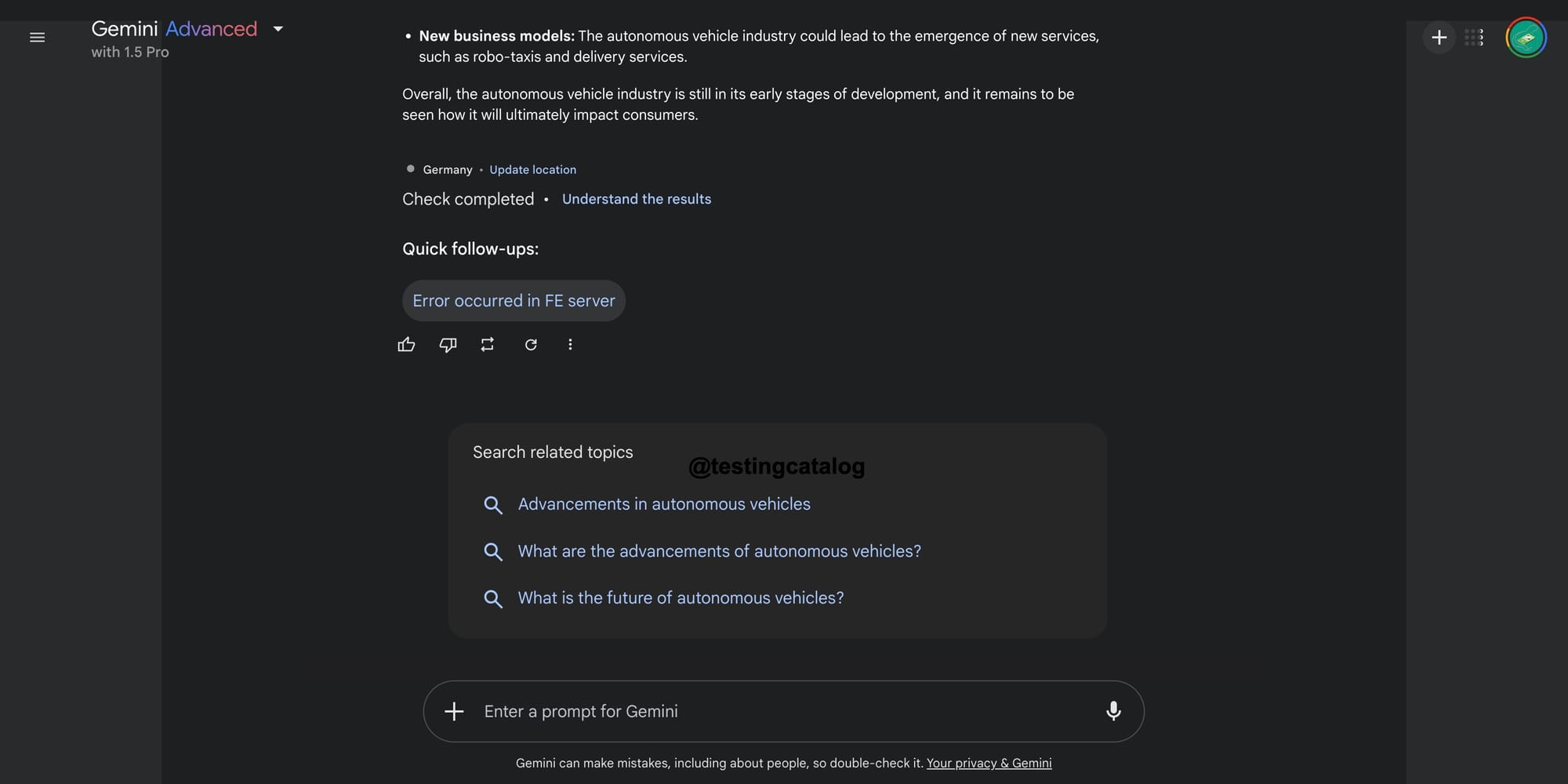
Google appears to be aligning its Gemini AI interface with the familiar design language of its core Search UI, as suggested by recent updates and leaks. According to insights shared by TestingCatalog, the Gemini homepage may soon feature conversation starters or search suggestions that resemble components already present in Google Search. This shift could signify Google's intent to create a unified experience across its AI and search platforms, making Gemini feel more integrated into its broader ecosystem.

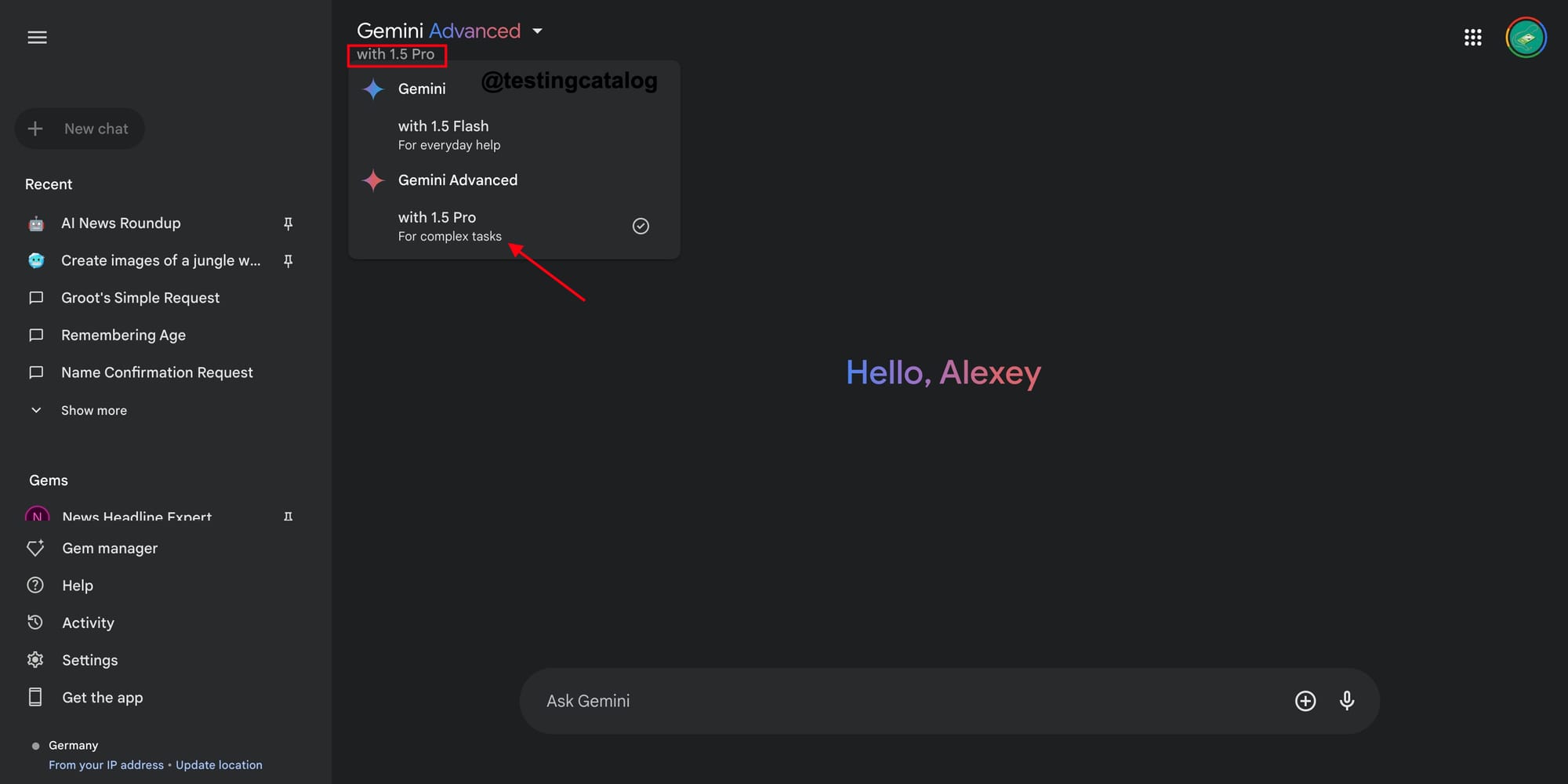
The reported updates also include changes to the model selector on the web interface, which may become more descriptive. This adjustment could hint at plans to introduce additional AI models in the future, potentially expanding Gemini's capabilities or offering specialized versions for different use cases. Such a move would align with Google's strategy of enhancing personalization and functionality across its AI offerings.

These developments come as part of broader updates to Gemini, which recently underwent a UI redesign for its Android app. The redesign removed cluttered elements like the carousel of suggested prompts and introduced a cleaner, more streamlined interface. Additionally, Google has been rolling out features such as "Saved Info," allowing users to personalize interactions by having Gemini remember preferences and key details about their lives.
One more Gemini update is tentatively scheduled for next week, November 25. Are the stakes getting higher now? 👀 https://t.co/m8u5CtzQBu pic.twitter.com/0pj6ZMub8z
— TestingCatalog News 🗞 (@testingcatalog) November 20, 2024
By making Gemini's interface more similar to its core Search UI, Google may be aiming to lower the barrier for new users while reinforcing its AI's role as an extension of its search capabilities. This integration aligns with Google's ongoing efforts to position Gemini as not just a chatbot but a multimodal assistant capable of handling complex tasks across text, image, and voice inputs. As Google continues to refine Gemini's design and functionality, these changes could set the stage for deeper integration with other Google products and services.


